Admin Panel Developer Guide
The Vectis admin dashboard is a SvelteKit 2 app (Svelte 5 runes) at vectis/admin/, running on port 5173. All GraphQL calls go through the /api/graphql BFF proxy.
Project Layout
admin/src/
├── routes/
│   ├── +layout.svelte          # Sidebar nav + command palette
│   ├── api/graphql/+server.ts  # BFF proxy (forwards to FastAPI w/ JWT)
│   ├── orders/                 # Order management pages
│   └── products/               # Product management pages
├── lib/
│   ├── houdiniClient.ts        # Houdini HoudiniClient (points at /api/graphql)
│   ├── houdini/                # Named GraphQL ops per page (queries + mutations)
│   ├── server/                 # Server-only helpers (sessions, api headers)
│   ├── help/{en,es}.json       # In-app contextual help
│   └── components/             # Shared admin components
└── app.css
Every page's GraphQL lives in $lib/houdini/<PageName>.ts as named ops. Houdini generates typed Store classes into $houdini at npx houdini generate time.
Page Pattern (Houdini)
Data loading uses a +page.ts (not +page.server.ts) with load_<QueryName> from $houdini:
// src/lib/houdini/Products.ts
import { graphql } from '$houdini';

export const ProductsListStore = graphql(`
  query ProductsList($limit: Int!, $offset: Int!) {
    products(limit: $limit, offset: $offset) {
      products { id name slug variants { id sku price { amount } } }
      total
    }
  }
`);
// src/routes/products/+page.ts
import { load_ProductsList } from '$houdini';
import type { PageLoad } from './$types';

export const load: PageLoad = async (event) => {
  const main = await load_ProductsList({
    event,
    variables: { limit: 80, offset: 0 },
  });
  return { ...main };
};
<!-- src/routes/products/+page.svelte -->
<script lang="ts">
  import { Package } from '@lucide/svelte';
  let { data } = $props();
  const { ProductsList } = data;
</script>

<h1 class="text-2xl font-bold flex items-center gap-2">
  <Package size={24} /> Products
</h1>
{#each $ProductsList.data?.products.products ?? [] as product}
  <a href="/products/{product.id}" class="text-blue-600 hover:underline">{product.name}</a>
{/each}
For client-side mutations, instantiate the generated Store class and call .mutate():
import { UpdateProductStore } from '$houdini';

const updateProduct = new UpdateProductStore();
const { data } = await updateProduct.mutate({ id, input: { name } });
To refetch after a mutation, use the query store's .fetch() — not invalidateAll():
import { ProductsListStore } from '$houdini';
await new ProductsListStore().fetch({ variables: {...} });
After adding or modifying any $lib/houdini/*.ts file, run npx houdini generate so types regenerate.
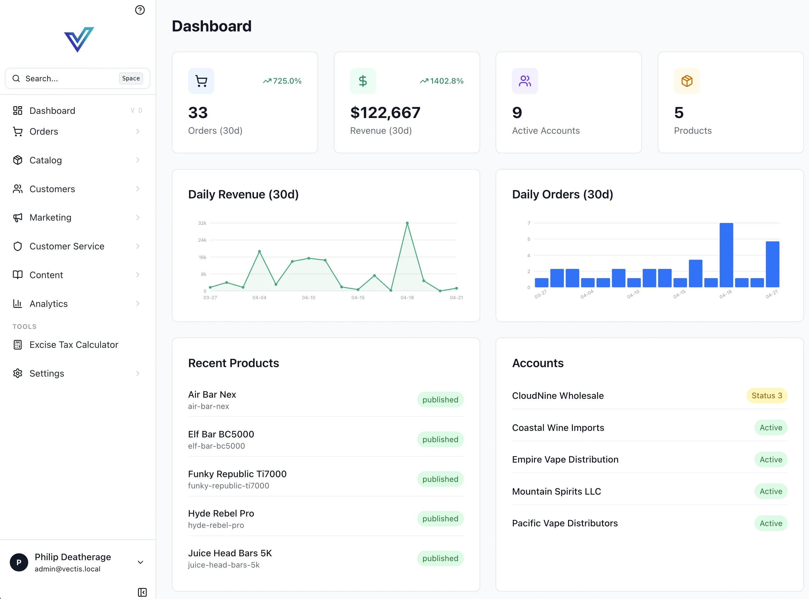
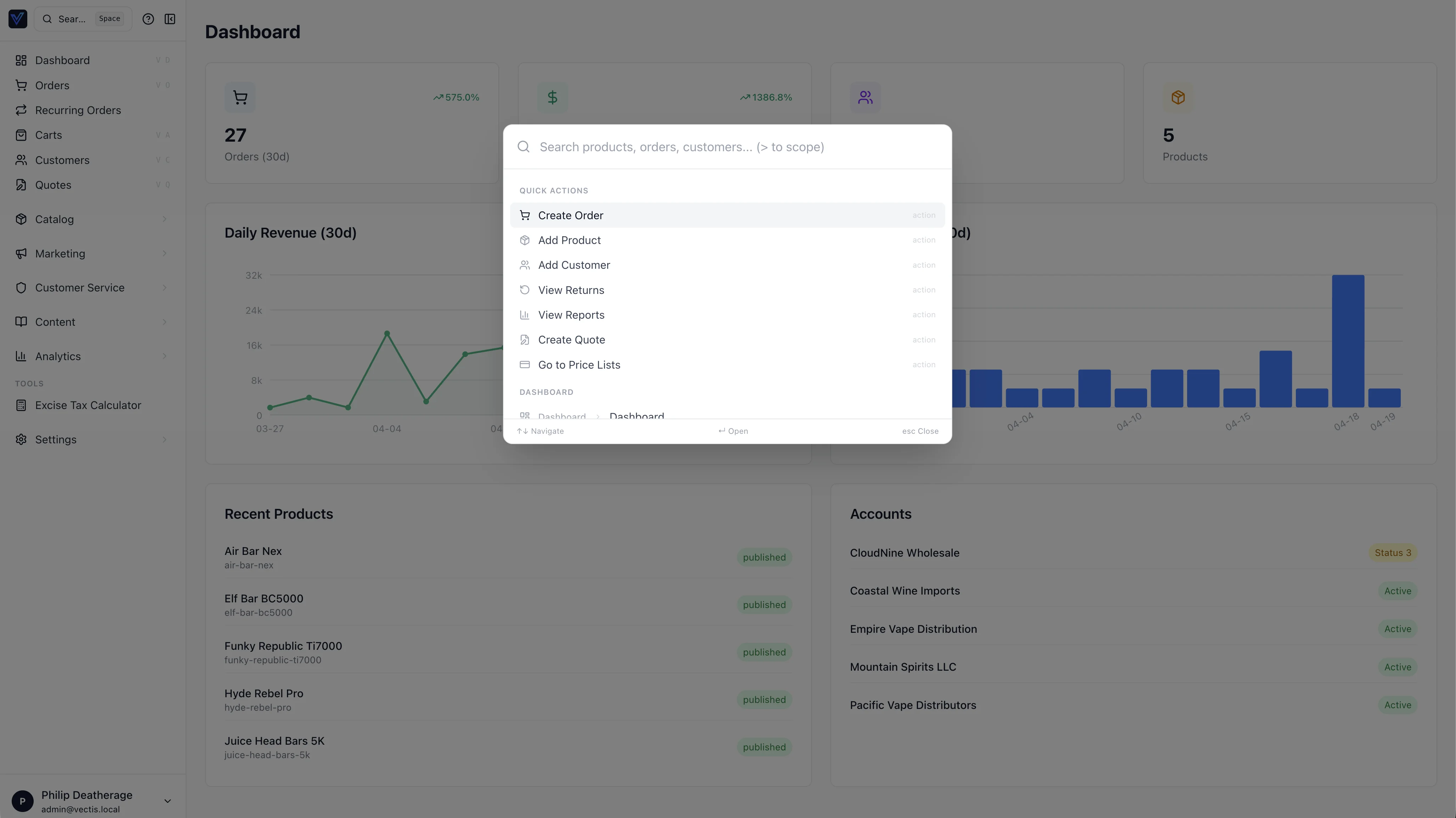
Layout: Sidebar + Command Palette
The root +layout.svelte provides a collapsible sidebar using Lucide icons, and a command palette triggered by Cmd+K (or Space). Navigation items are defined in mainSections and settingsItems inside +layout.svelte.
Sidebar drill-down submenus
The sidebar uses a drill-down replacement pattern. Nav items with a children array replace the sidebar contents when the current path matches the parent or any child route. The authoritative list lives in admin/src/routes/+layout.svelte (mainSections). Current top-level groups (children abbreviated):
- Catalog (
/productsparent) — Categories, Brands, Collections, Attributes, Traits, Inventory, Price Lists, Labels, QuickLinks - Customers (parent) — Registrations, Pending Changes
- Marketing (parent) — Gift Cards (conditional), Loyalty (conditional), Email Campaigns, Affiliates (Approvals, Commissions, Payouts), …
- Customer Service (
/fraudparent) — Returns, Refund Approvals, Store Credit, Reviews, plus extension-contributed items - Content (
/cmsparent) — Banners, Sliders, Media, Navigation, Tags - Analytics (parent) — Overview, Revenue, Orders, Products, Customers, Promotions, Affiliates, Aging Report, Banner Tracking, Slider Tracking
The Settings index has ~36 items with nested children (Checkout, Accounts, Packaging, etc.). Extension-contributed items use manifest.admin_nav_items (Decided #223) and graft into the matching section.
Channel context (Decided #164)
The current channel is resolved server-side and forwarded to the API as the X-Channel-Slug header (handled by the BFF route at /api/graphql/+server.ts). Admin routes themselves are flat (/orders, /products, etc.) — there is no /c/<slug>/ URL prefix. The channel switcher in the sidebar header writes the chosen slug to a cookie; subsequent requests carry the header. Page loaders should not assume "current channel" — request it from the helpers in $lib/server/api.ts.
Back-link convention:
- Main nav submenus show a single "Back to menu" link to
/. - Settings sub-submenus (e.g., Checkout children) show two links: "Main Menu" →
/and "Settings" →/settings, so the user can jump directly to either level.
Registering a new submenu group
Add a children array, subnavLabel, and optionally parentSubnavLabel to a MainNavItem in mainSections:
{ href: '/primary-route', label: 'Menu Label', icon: SomeIcon,
  subnavLabel: 'Section Title',
  parentSubnavLabel: 'Parent Link Label',
  children: [
    { href: '/child-a', label: 'Child A', icon: ChildAIcon },
    { href: '/child-b', label: 'Child B', icon: ChildBIcon },
  ]
}
The activeMainSubnav derivation detects active state automatically. Child routes are included in allNavItems() for the command palette.
Default landing page (staff profile)
defaultLandingPage in My Profile controls where the user is sent immediately after sign-in only: /api/login and /api/oauth/callback read myPreferences { defaultLandingPage } and return or redirect to that path. The root route / is always the Dashboard; it must not redirect, or the sidebar Dashboard link would be wrong.
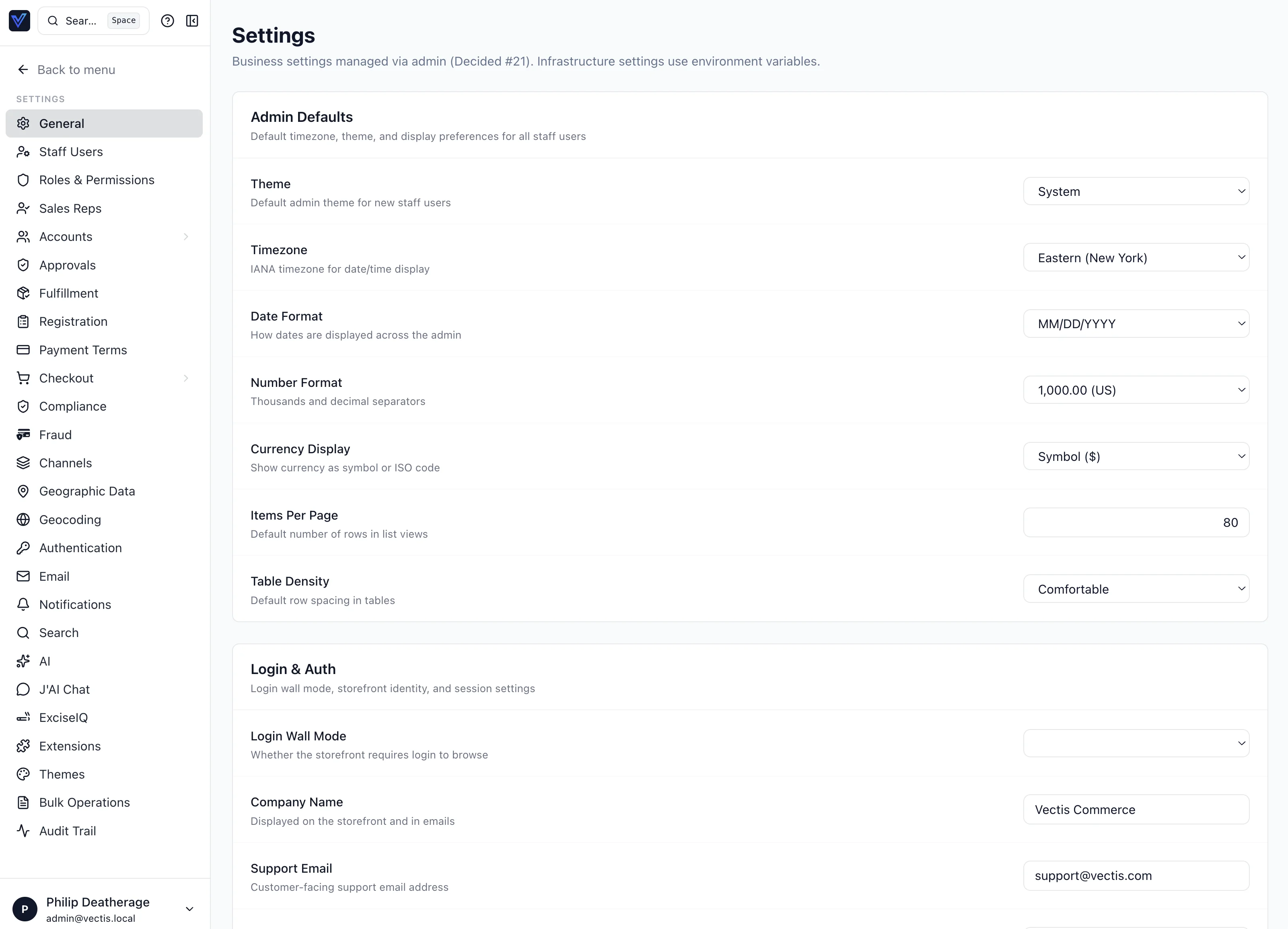
Settings pages (layout & actions)
Staff-facing settings such as My Profile and My Security use the same patterns as the rest of admin: card sections, admin-input for fields, and btn-primary / btn-secondary / btn-danger with a Lucide icon on every action control (see app.css component layer). Avoid one-off bg-blue-600 primary actions.
The top-level Settings index is a two-pane drill-down: a left rail of settings categories and the selected panel on the right.
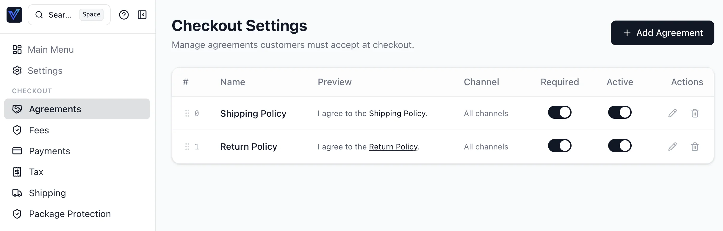
Deeper settings pages use the same pattern — here's the Checkout → Agreements panel:
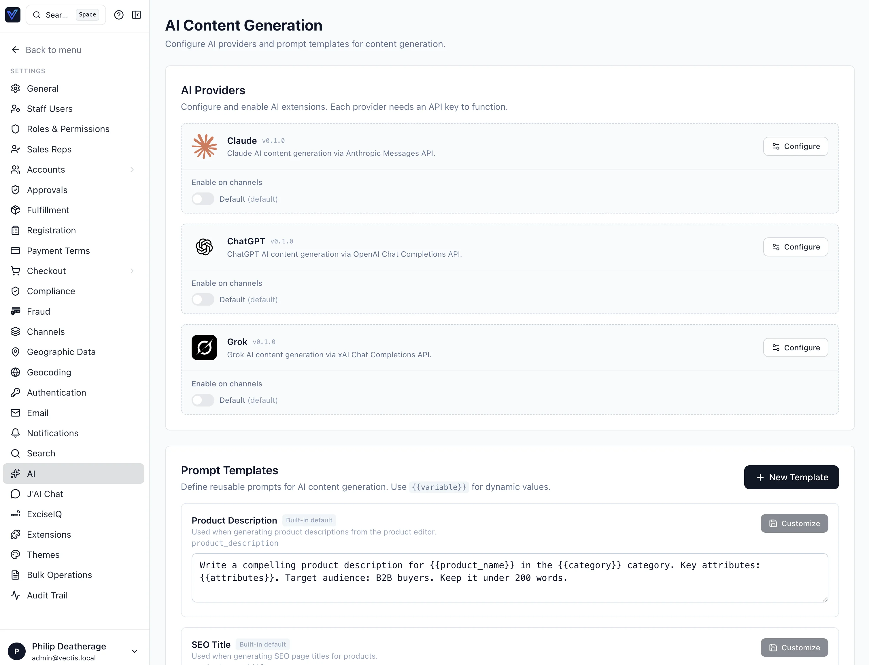
AI providers and prompt templates live at Settings → AI:
Avatar upload (cross-host admin)
My Profile uploads go through the admin BFF (/api/upload-avatar) to the backend POST /api/upload/avatar. If the primary file storage strategy fails, the backend may fall back to local disk under /uploads. Relative /uploads/... URLs would load from the admin host and break when admin and API use different origins (e.g. admin.vectis.eto vs api.vectis.eto). Set PUBLIC_API_BROWSER_ORIGIN on the API (and recreate the container after changing compose) so local strategy URLs are absolute; set the same variable on the admin service so the BFF can rewrite any relative /uploads response. docker compose restart does not apply new environment variables—use docker compose up -d --force-recreate api (and admin if needed).
Settings: Notifications
The route settings/notifications loads notificationTemplates (including bodyTemplate and variables) and notificationLogs via its Houdini query store in $lib/houdini/SettingsNotifications.ts. Inline editing uses the generated UpdateNotificationTemplateStore mutation; after a successful save, the page refetches by calling .fetch() on the main query store. Staff preferences for other users are read/updated with notificationPreferences(userId) and updateNotificationPreference (both require settings.edit).
Help System
Two components provide contextual help: HelpDrawer (full-panel, triggered by ? icon) and HelpTooltip (field-level). Content is stored in $lib/help/en.json and es.json:
{
  "products": {
    "title": "Products",
    "overview": "Manage your product catalog, pricing, and inventory.",
    "fields": {
      "sku": "Unique stock-keeping unit identifier.",
      "price": "Base price before customer-specific price lists."
    },
    "tips": ["Use bulk import to add products from a CSV file."]
  }
}
DataTable Component
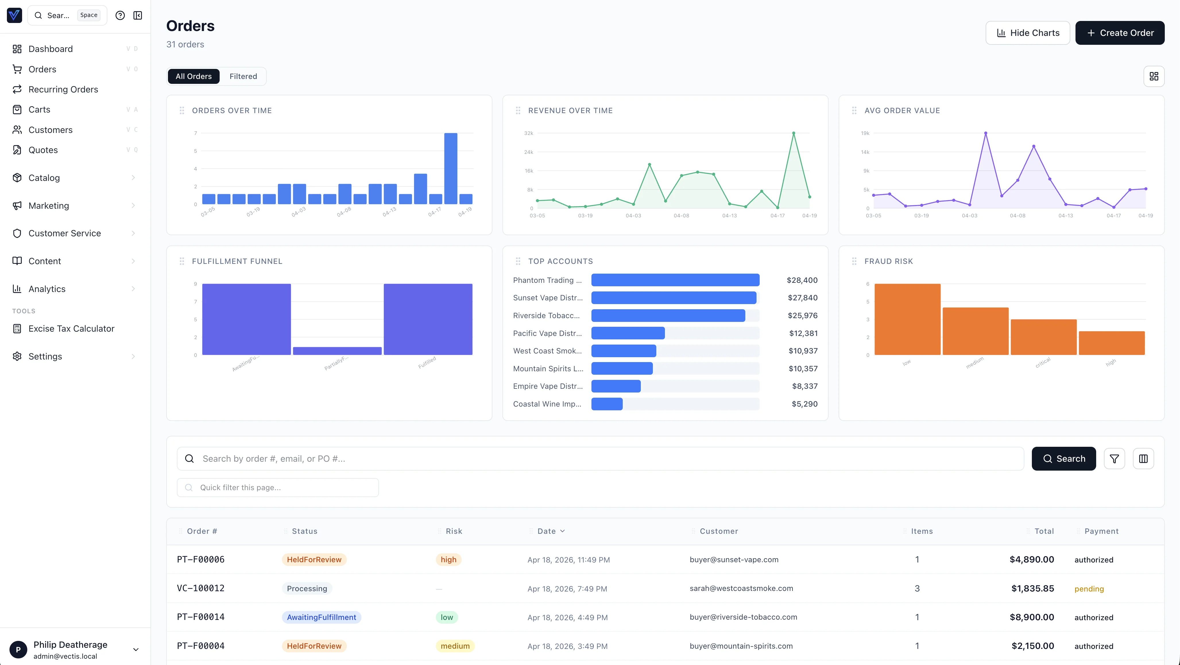
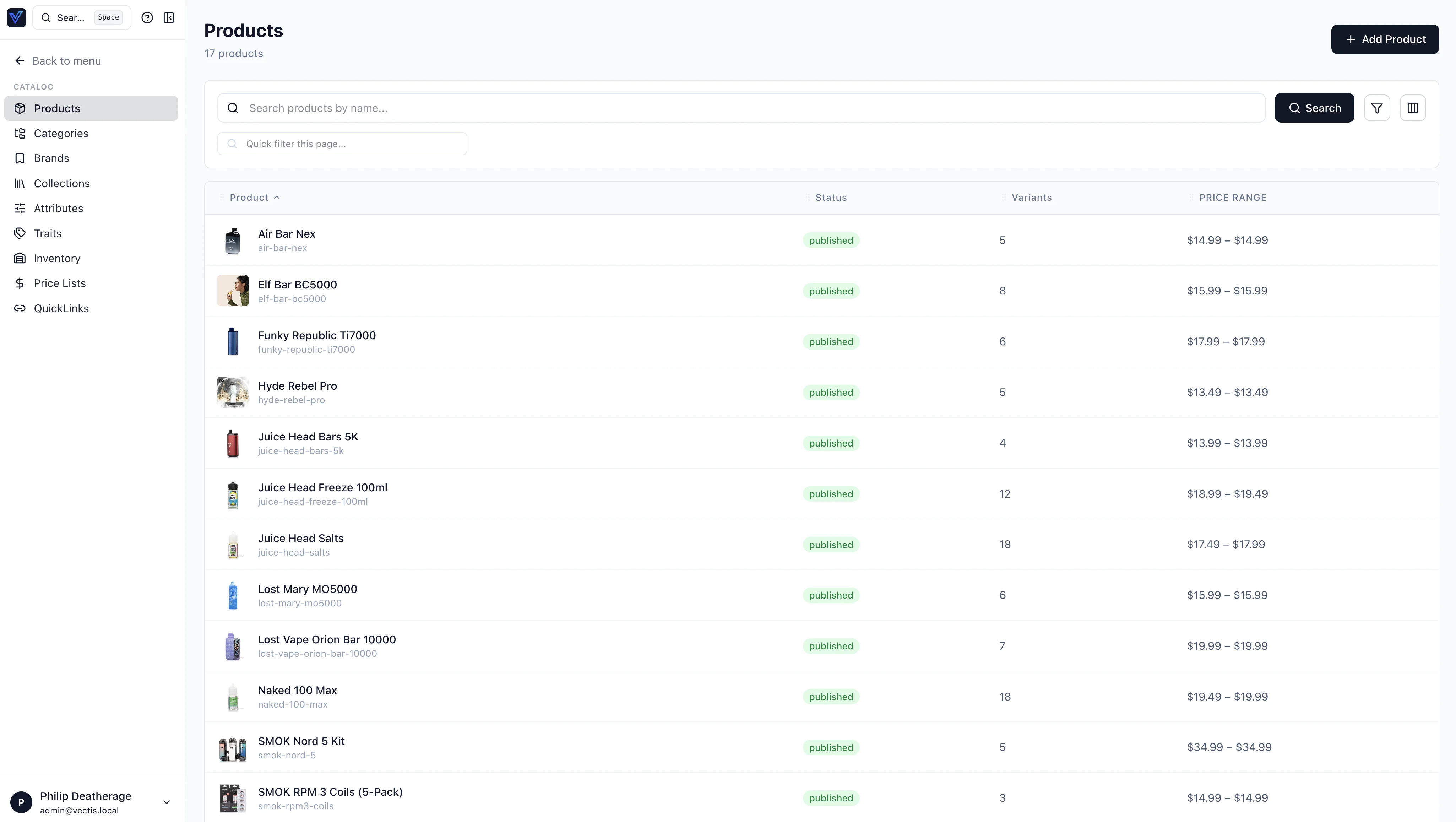
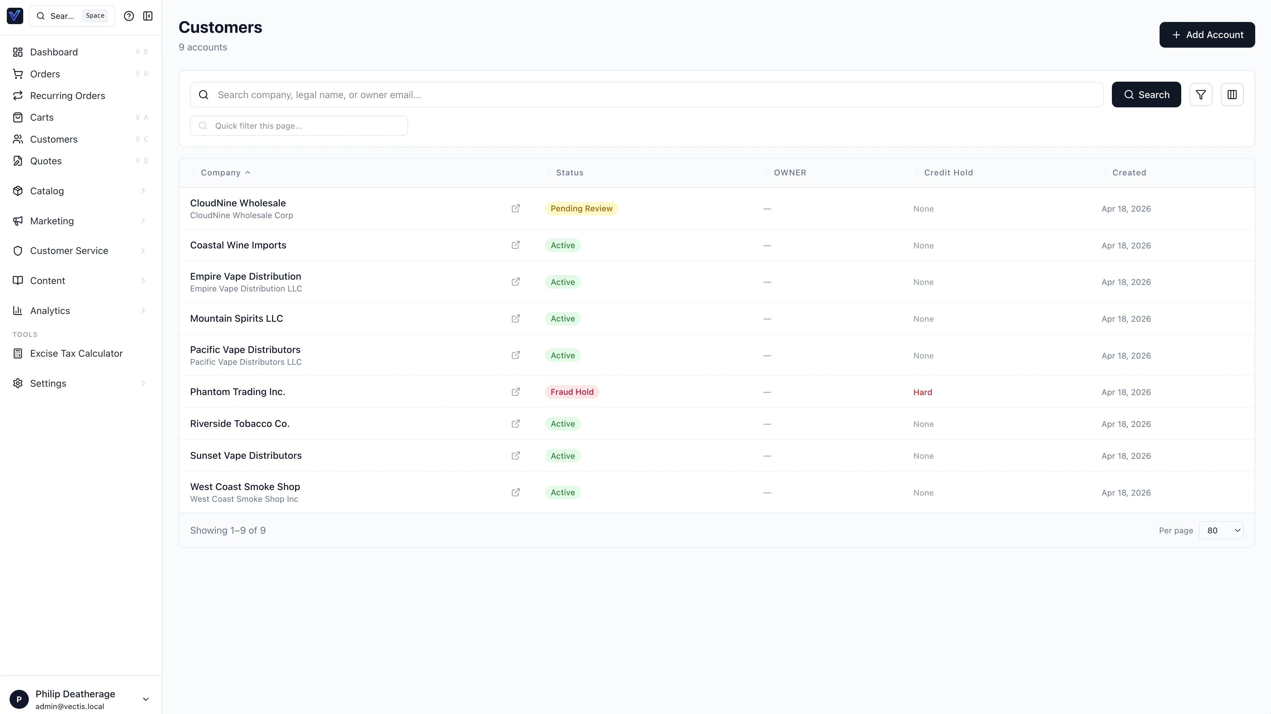
All admin list pages use the shared DataTable component ($lib/components/DataTable.svelte). Examples below show the Orders, Products, and Customers list pages:
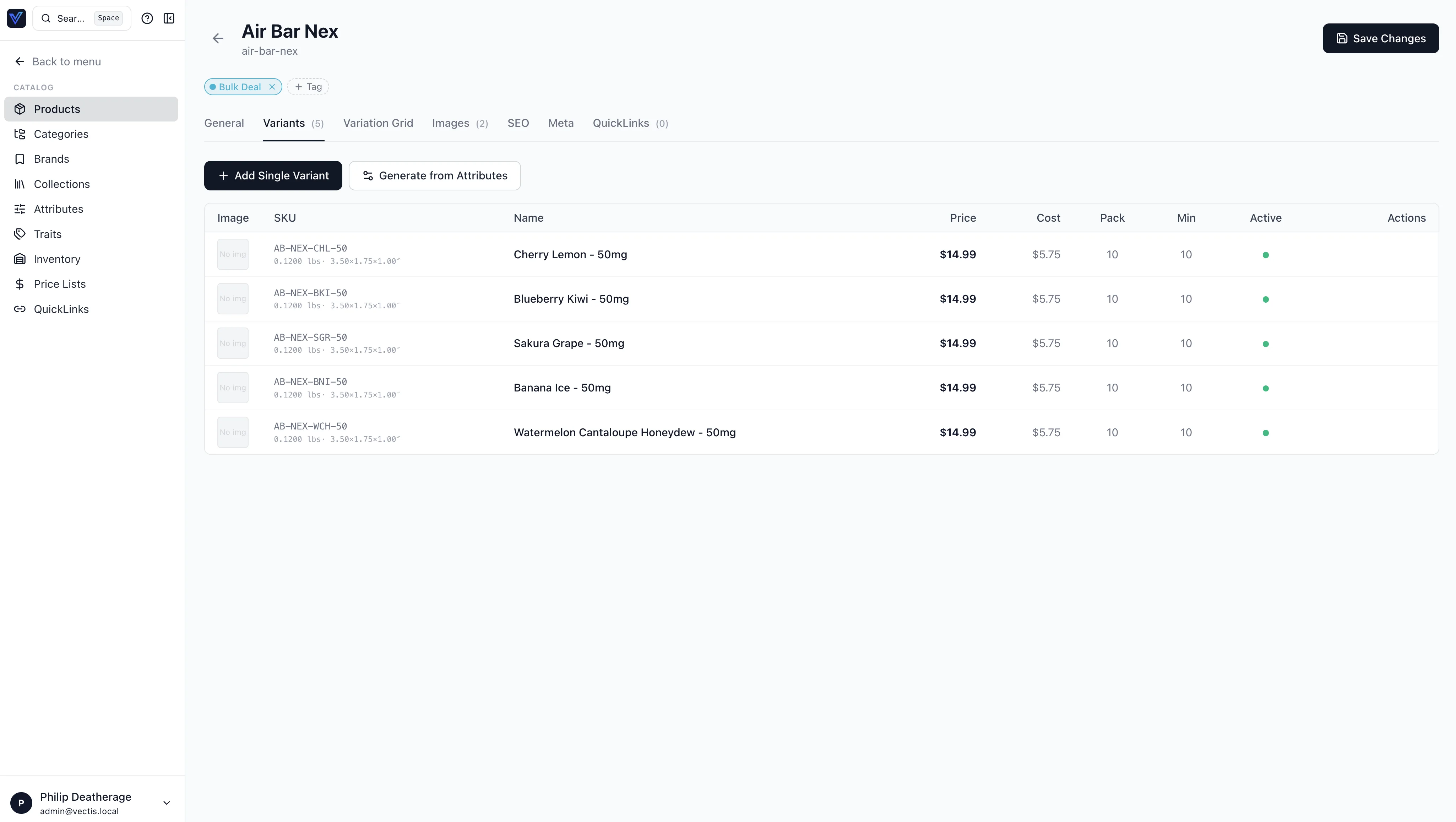
Product detail uses the same patterns for child tables — here's the Variants tab of a product:
It provides:
- Server-side search — text input triggers URL-based search on Enter
- Client-side fuzzy filter — "Quick filter this page" input uses trigram matching (
$lib/utils/fuzzy.ts) across all visible columns - Sortable columns — all columns sort by default (
sortable: falseto disable). Headers withkey === 'actions'are never sortable. Click toggles direction. sortMode="server"(default) — updates URLsortBy/sortDir; the loader passes them to GraphQL. Server column names are derived with$lib/utils/dataTableSort.ts(resolveServerSortKey: camelCase → snake_case plus a few aliases likegrandTotalAmount→grand_total).sortMode="client"— for pages that load the full list in one request (brands, collections, CMS pages, audit, etc.): sorts the rows already in the browser (after the quick fuzzy filter).- Filters — togglable filter bar with configurable dropdowns (
type: 'select'ortype: 'date'). The Customers list mirrors Orders: multi-criteria server filters (status, credit hold, tax exempt, currency, risk level, customer group, created/updated date ranges) with URL-backed state. - Column visibility chooser — Columns button opens a popover with checkboxes for non-standard columns. Choices persist server-side in
StaffProfile.column_preferencesJSON column viaupdateMyProfilemutation (debounced 500ms) - Permission-gated export — Export CSV button only visible when user has the required permission codename
- Bottom pagination — always at the bottom: "Showing X-Y of Z", per-page selector (20/40/80/120), page navigation
Column Visibility
Each column definition has a visibility field:
standard— always shown, cannot be hidden (e.g., Order #, Product Name)default— shown by default, user can hideoptional— hidden by default, user can opt in (e.g., PO #, Carrier)
Usage
<script lang="ts">
  import DataTable from '$lib/components/DataTable.svelte';
  import type { ColumnDef } from '$lib/components/DataTable.svelte';

  const columns: ColumnDef[] = [
    { key: 'name', label: 'Name', visibility: 'standard' },
    { key: 'status', label: 'Status', visibility: 'default' },
    { key: 'slug', label: 'Slug', visibility: 'optional' },
  ];
</script>

{#snippet renderCell({ item, column, value })}
  {#if column.key === 'status'}
    <span class="badge">{value}</span>
  {:else}
    {value ?? '—'}
  {/if}
{/snippet}

<DataTable
  items={data.items}
  {columns}
  pageId="my-page"
  total={data.total}
  currentPage={data.page}
  pageSize={data.pageSize}
  sortBy={data.sortBy}
  sortDir={data.sortDir}
  searchQuery={data.search}
  columnPreferences={data.preferences?.columnPreferences?.['my-page']}
  permissions={data.permissions}
  exportPermission="import_export.export"
  exportFn={handleExport}
  onRowClick={(item) => goto(`/my-page/${item.id}`)}
  {renderCell}
/>
Shared Utilities
- Fuzzy search —
$lib/utils/fuzzy.ts:fuzzyFilter(),fuzzyMatch(),trigrams(),trigramSim(),tokenize() - Server sort keys —
$lib/utils/dataTableSort.ts:resolveServerSortKey(),camelToSnake() - CSV export —
$lib/utils/export.ts:exportCsv(filename, headers, rows)
Cmd-K Federation (Decided #226, #227)
Extensions contribute quick actions and search results into the global Cmd-K palette. The +layout.svelte palette reads:
installedExtensions { adminQuickActions { href label iconName permission } }— flat list of registered quick actions, filtered by the caller's permissionsfederatedSearch(query)— async, merges results from every extension's registeredsearch_indexesprovider into the palette's results
Quick actions show in the "Extensions" group of the palette by default. Use the iconName field (Lucide icon string) so the palette stays icon-consistent without each extension bundling assets. Federated search results are grouped by extension display name and capped at 10 per source.
Refund Approval Inbox (OQ #27)
/refund-approvals is the queue page for refunds that exceed the channel threshold or that the policy requires an approver for. The inbox uses Houdini stores in $lib/houdini/RefundApprovals.ts:
RefundRequestsListStore— paginated list with status filter (pending,decided,executed,failed)DecideRefundApprovalStore— approve/reject mutationRetryRefundExecutionStore— retries the Temporal workflow forfailedrows
The detail panel shows per-tender progress (each card/ACH/store-credit tender separately) so the approver can see which legs already settled before deciding. Self-approval is blocked at the API; the UI hides the Approve button when the requester matches the current user.
Workflow Faults (Decided #200)
/workflow-faults lists rows from the workflow_faults table (sourced from vectis.workflow.fault.v1). Filters by severity, fault_code, and date range. Each row deep-links to the underlying entity (cart, order, refund request) and exposes a "Retry workflow" action where applicable.
Customer Onboarding Playbook
The application repo carries vectis/docs/CUSTOMER_ONBOARDING_PILOT.md — a structured runbook used by support / customer-success during white-glove onboarding (store-credit seeding, demo accounts, OAuth providers, Houdini schema regeneration). There is no in-admin route for this yet; reference the markdown directly.
Adding a New Admin Page
- Define GraphQL ops — create
src/lib/houdini/MyPage.tswith agraphql(...)query store and any mutation stores - Generate types —
npx houdini generate(runs as part ofnpm run check) - Create the route —
src/routes/my-page/+page.ts(loader callingload_MyPage(event)) ++page.svelte - Add navigation — append to
mainSectionsin+layout.svelte: - Use DataTable — for list pages, define columns with visibility levels, use the DataTable component
- Add help content — add entries to both
$lib/help/en.jsonandes.json - Update docs — add a usage guide if the page is user-facing
Tip
Use Lucide icons consistently — 16px for sidebar nav, 24px for page headers. Import from @lucide/svelte.